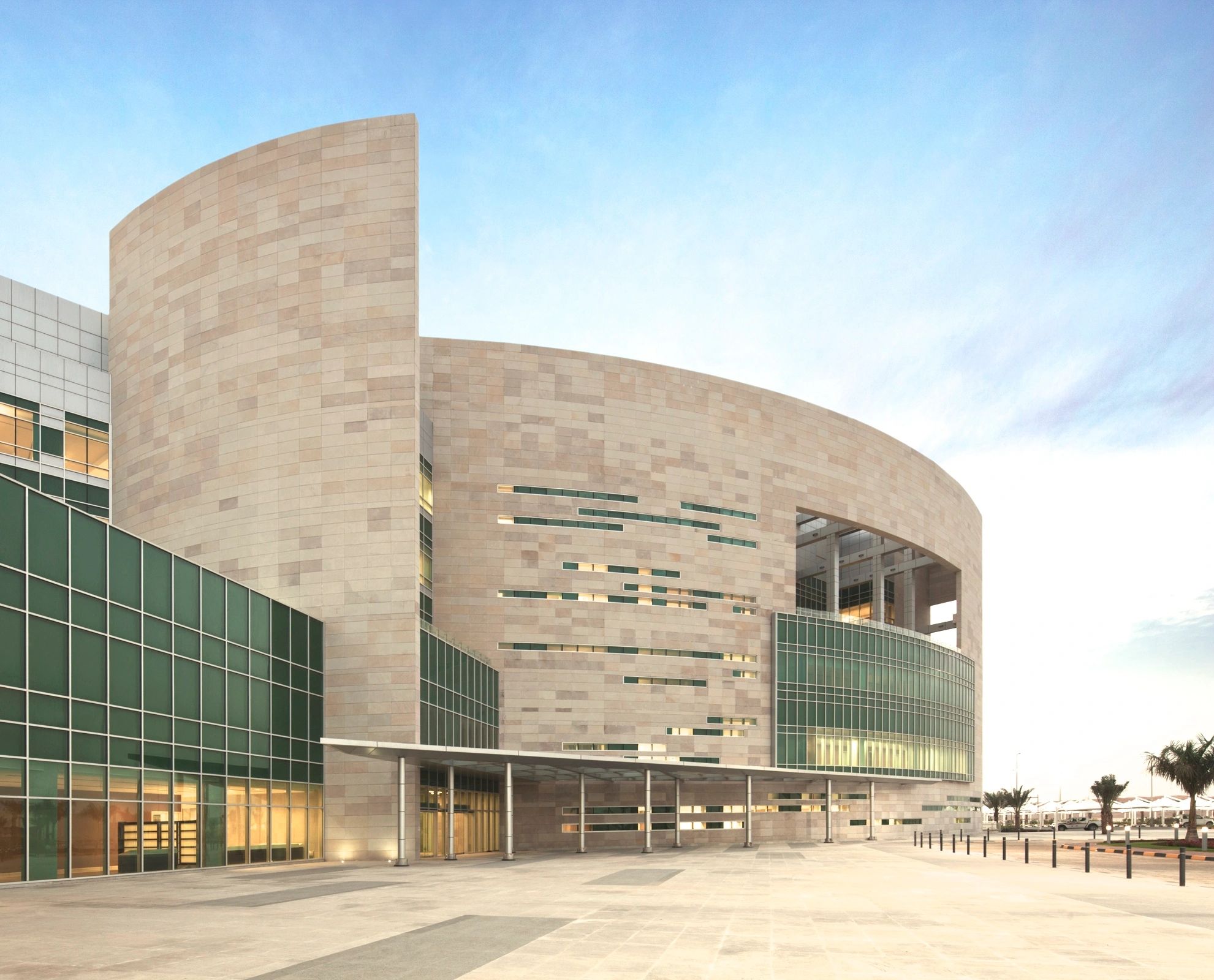
Specialty Hospital in the United Arab Emirates, 2006 – with Perkins Eastman Architects

This project was a fitting and happy capstone to my architectural career. It was a ‘dream’ project because I was given a blank slate by the clients, an opportunity that rarely happens in the healthcare field, where we find ourselves always ‘adding on’ to existing, less than optimal building complexes.
On this beautiful, unencumbered site I could create a facility to embody every positive principle I had espoused and learned over my previous 40 years in the profession. It allowed me to answer the question I had always kept in the forefront of my mind, “How can architecture reduce stress in this architecturally underserved healthcare population – patients, families and staff?”

Patient floors are accessed by gently curving corridors along natural light.

The surrounding desert is enchanting in the rosy color of its sand, and in the scattered groves of feathery trees. All the patient rooms are oriented towards this view.

For the building's facade, the goal was to create a welcoming, stress-relieving image, a place to get well.

The entrance should feel like entering a health club or a fine hotel.

Inside the building, the planning goal was to achieve stress reduction and functional efficiency by keeping patients and families as separate as possible from staff and service areas. Public circulation (yellow) enjoys daylight and views while accessing clinical spaces..

Along the softly curving public corridors, with their playful placement of windows

Therapy areas bathed in natural light.

The inpatient wings are clad in sun screens where most exposed to solar gain.
Rabin Medical Center, Davidoff Pediatric Cancer Center, Tel Aviv, Israel, 2002 – with Perkins Eastman Architects

All single-room child- and family-friendly hospital pavilion attached to a major medical center. Exterior design by Eran Chen, Design Associate

Entrance lobby, bringing in natural light

Pediatric treatment spaces designed to be interesting, playful, and as soothing and stress-reducing as possible.
Saint Barnabas Medical Center Ambulatory Care Building, 1995 – with Architecture for Health, Science & Commerce

The project consisted of creating a major ambulatory care facility out of two vacant corporate office buildings. The first move was to unite the two separate structures by adding a welcoming two-story skylit entrance lobby.

Welcome to the health center!

The appearance of the public circulation was very important. Although devoid of natural light, it had to shun the medical feeling by introducing natural materials like wood finishes, and art work.

One of the most dramatic spaces in the existing buildings was this two-story curved glass public space, which we converted into the Physical Therapy department. A feel-good space for activities that reinforce 'getting better'.

A reflecting pool was one of the serendipitous features of the existing site.
Outpatient Clinic in Brooklyn, NY, 1997 – with Architecture for Health, Science and Commerce

Even a small, humble project like this requires careful attention to patient and staff quality of life. A square existing building still can be planned for separation of areas. Staff enter at the top, (blue areas) while patient and family enter from the Sutter Avenue street front (red areas). The main circulation is enriched by the only available natural light, roof skylights (yellow squares).

Patient way finding is enhanced by creating memorable interior landmarks of canted, variously colored walls in the main spine corridor.


Key to functional areas

Renderings by Design Principal Chan Byun
Kaiser Permanente Vallejo Medical Office Building, 1990 – with Skidmore, Owings & Merrill

One of my proudest achievements, a holistic Medical Office Building, with natural light and garden views throughout all the public and patient circulation.

The hospital administration had rejected a corporate plan for a standard glass box Medical Office Building (M.O.B.). We proposed an entirely new concept based on a simple diagram of separation of functional zones, and a determination to bring in natural light to all the circulation. The M.O.B. we designed is at the right, attached to the existing hospital. Two major courtyards are shown, plus a smaller square one off the main spine.

Each clinic is accessed by the public circulation shown in yellow, navigating off the main left-to right spine

The typical building block of the M.O.B. This concept diagram allows patients and families their own circulation, with health-giving natural light, while physicians access their windowed offices by their own private corridors. No embarrassing unintentional hallway encounters.

The patient zone and the staff zone are kept apart until they intentionally meet in the exam room area. Afterwards, they disengage and return to the comfort of their own zones.

A typical waiting area, with garden views and alternate options for seating.


The second story of the M.O.B. repeats the circulation concepts of the main floor.


There are entrances and elevator lobbies at each end of the main spine.

Natural light and garden views imbue the whole facility.
.jpeg/:/)
St. Lukes-Roosevelt Hospital, New York, NY, 1989 – with Skidmore Owings & Merrill

The starting point is a concept diagram of separation of functions, that are intentionally brought together only when necessary and appropriate.

A typical patient floor is accessed by three separate elevator cores – public/family, staff/patient, and service/materials.

Public and family arrival (blue) on the floor is controlled at the nurse station before passing by any patient rooms.

'Stacking diagram' in response to the concept diagram at top. Inpatients (red) on upper floors, diagnostic and treatment spaces (green) in the middle, accessible to the inpatients above and the ambulatory care patients (orange) below.


Now renamed Mt. Sinai West, at 10th Ave. and 58th St., NYC