Vacation House in Vermont, 1967 – with three other Architecture students: George Gardner, Ted Judson and Jeremy Scott Wood


The building site is across a pond from the parking area, hence the bridge approach. The advantage of coming into a tall house in the middle is it minimizes climbing inside the house.

Multi-page article in DOMUS magazine, 1970. I wrote the text in Italian and English.

The living and dining areas.


Upper levels are for living spaces, with areas for overflow sleeping.

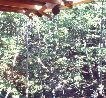
The site had fabulous mountain views, but not wishing to cut down lots of trees, we built up.

The lower spaces are for sleeping (red).


The top photos are the kitchen, which is placed near the entrance (clear glass door), and serves the dining area only a split level above.
The master bedroom in the lower photos is accessed by stairs built into the bureau. Its bed sits on top of the bathroom, thus saving space and construction cost.

Two story bunk room with internal ladder to the bathroom
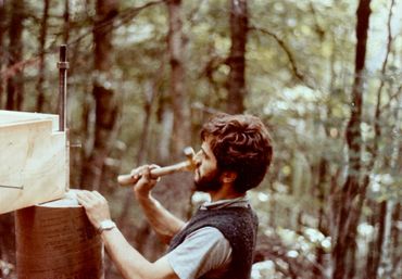
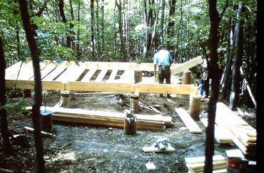
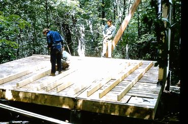
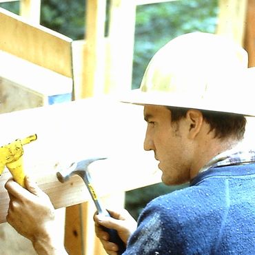
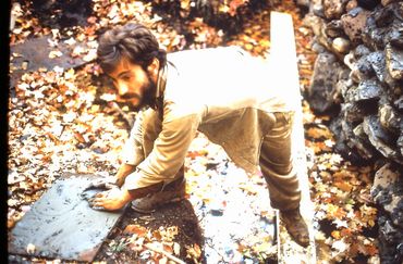
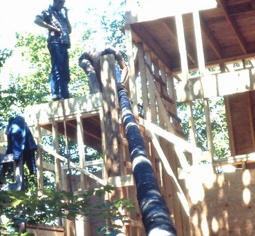
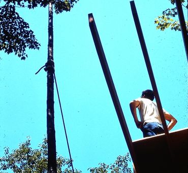
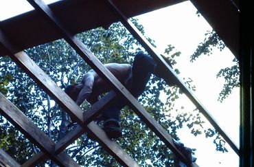
Learning by doing, Summer 1966



House in Tahiti, 1970 – in my own practice

The client wanted a hermetic, well soundproofed and air conditioned house for his book collection and sleeping areas, yet it was clear that his living spaces and kitchen should reflect the style of a Tahitian beach bungalow, and also embrace the pool.

The plan combined the hermetic, sealed areas, at top, with the very open, sliding glass doors and screened living, dining and kitchen areas. Slipping these two masses past each other, a simple hipped roof (dotted line) provides a carport at upper right, and notching the roof at at bottom left gestures toward the pool.

The intersection between the closed, air conditioned wing and the open, Tahitian fare bungalow was highlighted by an ascending rubble wall.

House in Columbia County, NY, 1979

The hilltop site had a stunning panoramic view, and the clients also wanted to enjoy looking up at the tall trees behind.

The basic program was a simple barn, with a master bedroom on the ground level and a child's bedroom in the loft.

The 'simple barn' was tweaked at each end by 45 degrees. One end became the master bedroom projection, while the other end allowed a slanted skylight oriented to the woods behind the house.


The horizontal windows capturing the panoramic vista, and the generous skylight bringing in a view of the tall trees. Note the stairs to the children's sleeping loft.

Guest cottage in Suffolk County, NY, 1983

(Construction photograph)
Zoning allowed only a 20' x 40' footprint, so the ground floor accommodated only the kitchen, bathroom and living room, while the bedroom needed to be upstairs. A diagonally cut roof allowed a small deck beside the bedroom, and a triangular skylight over the living area.
House in Ulster County, NY, 1997

This house grew as it converted from a 1990 off-the-grid vacation cabin (right) to a fully modern house in 1997 (middle and left).

A further two-bedroom addition in 2016 accommodated the growing family.
Curves Over Manhattan, 1982

Four apartment renovation projects that, while addressing clients' needs, also inject softer, more natural curves into otherwise boxlike living spaces.

Apartment 1 – Curving wall wrapping storage, kitchen and bathroom in an open plan loft.


Apartment 2 – Glass block curve around the shower, that is shared and accessed from his and hers bathrooms.
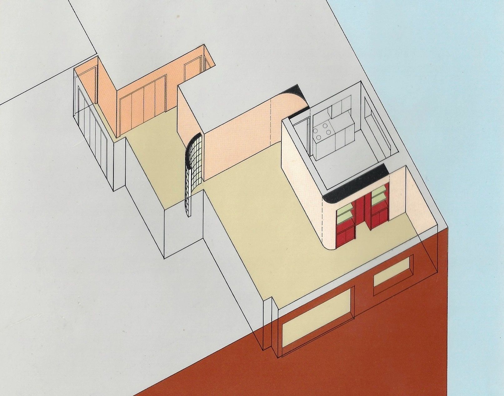
Apartment 3 – Glass block curve to shield a dining alcove from the entrance door.

Apartment 4 – The renovation also significantly reorganized the circulation, and highlighted it by brightly colored archways.


New York Times Home section front page article featuring the apartment above.

Before and after diagrams showing the apartment reorganization responding to how the clients actually wanted to live and relate.